Friday, 10 February 2012
Screenshots of my Digipak
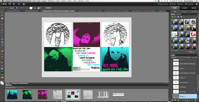
I was playing around with the effects on the images and I got one that created a kind of silhouetted image and I decided to change the hue/saturation to create different colours so I chose green, pink and blue. I really like how these have turned out as they are all quite bright and the contrast works really well.
I really like how my digipak is starting to look as I decided to change it because there wasn't much of a link between the poster and the digipak after I made my poster so I decided to start from scratch again. I also chose to take shots from the music video to create the discs and kept them black and white as they are to keep a contextual reference to the music video. However, I changed the contrast to keep them similar to the other images with a high contrast.
For the front cover I have chosen to use my favourite out of the images I have used, another reason that I chose to do this is because this one is the only one that is quite close up so the others are quite similar, making the digipak look slightly symmetrical. I then chose to use the same font as I used for my poster with the album name and artist name.
For the back of the digipak I am writing the song titles in the font I have previously used but just making it smaller so it suits the style more and is easier to use.
10-02-2012
Today I managed to finish my digipak and poster to the quality I am happy with. I am happy with the overall outcome and the fact that I have included references between the two products and also references to the music video. Also, we added the finishing touches to our music video, ready for when we return from our half term so we can screen our final product to the rest of our class and maybe gain some further feedback on what we have tried to improve upon from our first screening.
Screen shots of my Digipak process
Here are all the screenshots that I made of the process of my digipak. I decided to use colours of the images as a theme of the digipak so I decided to make the song titles of the same colours. Also as you can see in the last one I decided to include the barcode and the Sony BMG logo to make it look more realistic. I'm quite happy with the outcome. There are lots of connotations linking the digipak to the poster and the high-contrasted images make the link to our music video and our idea of sleep all day and party all night.
Poster Edit
I made some edits from the last poster as I thought the alignment wasn't very good as 'DJ DES' was on the other side to the rest of the font. I thought this looked slightly odd so I moved the text all aligned to the left. I also chose to add in the Sony BMG logo although I had to invert this on Photoshop as it is originally white with black text. I am happier with this outcome as I think it flows better as the text has been adjusted.
Subscribe to:
Posts (Atom)


